A Holistic Event Design for Tietoevry
Translating a digital brand into physical space through cohesive environmental design, spatial planning, and 3D visualization.
Overview
Tietoevry had recently undergone a major brand refresh, but their existing brand guidelines didn't address physical event environments. The company needed a distinct event identity that felt cohesive with their digital brand while working effectively in three-dimensional space, from large-scale exhibitions to intimate activations.
As the industrial designer on this project, I was responsible for translating the brand into physical form, creating flexible booth systems that could scale across different event types while maintaining a consistent visual and spatial language.
“We experience the world through our senses. With that logic, the same can be said for how we experience brands, particularly in an event setting.”
The Challenge
Tietoevry's digital brand identity (clean, modern, technology-forward) needed to work in physical environments where people move through space, interact with surfaces, and experience lighting and materiality.
The existing brand system had no defined approach for booth layouts, signage hierarchy, or spatial planning.
The Solution
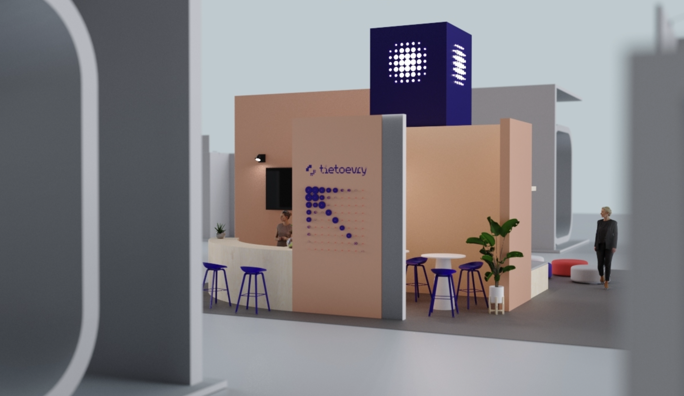
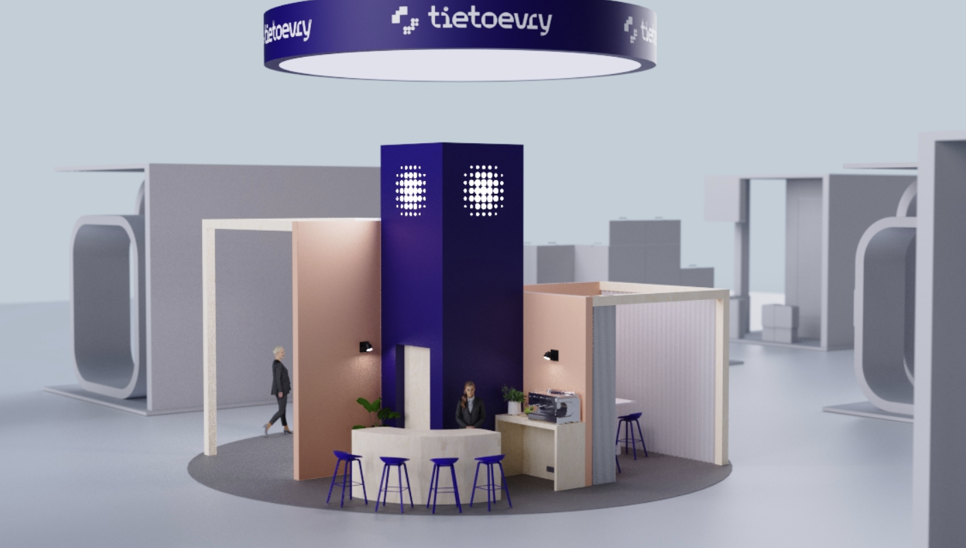
I developed a modular event system built around repeatable spatial elements. This included defined zones, consistent lighting strategies, and a refined material palette that translated the digital brand into tactile experience.
Every booth configuration followed the same design principles, ensuring brand consistency whether at a small trade show or a large industry conference.
Developing the Event Identity
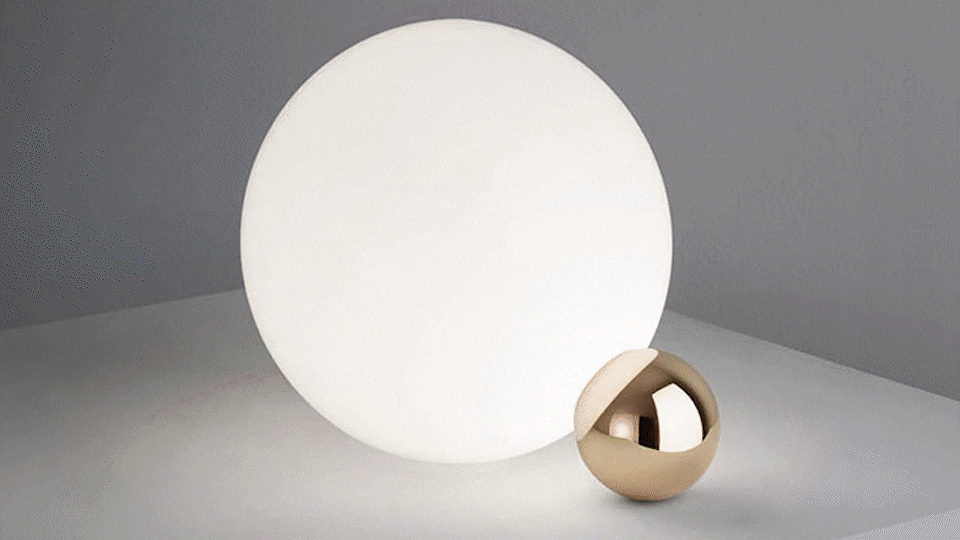
From Logo to 3D Illustration
The first step was extracting design elements from Tietoevry's logo to develop a visual language that could work in three dimensions. I explored different geometric interpretations and tested how the brand's core shapes could translate into spatial forms.


These 2D explorations were then translated into 3D forms using Rhino and rendered in Keyshot. The goal was to create visual elements that could be used across different touchpoints — from signage to booth structures to digital displays.
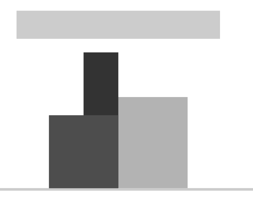
2D Explorations
Event Implementation
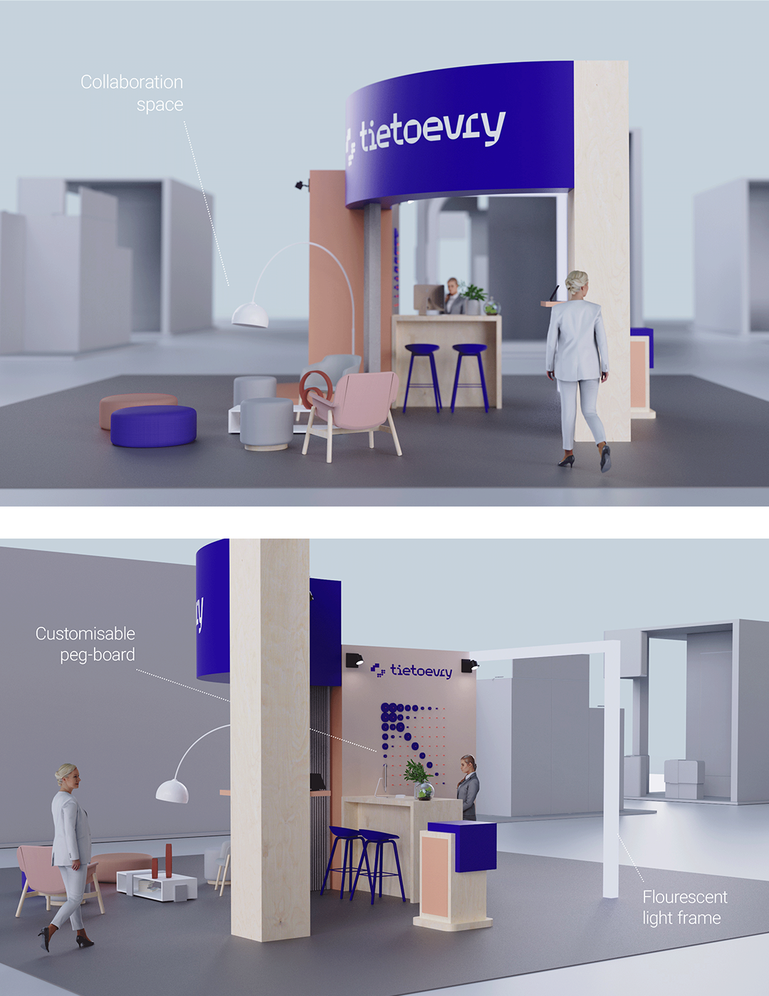
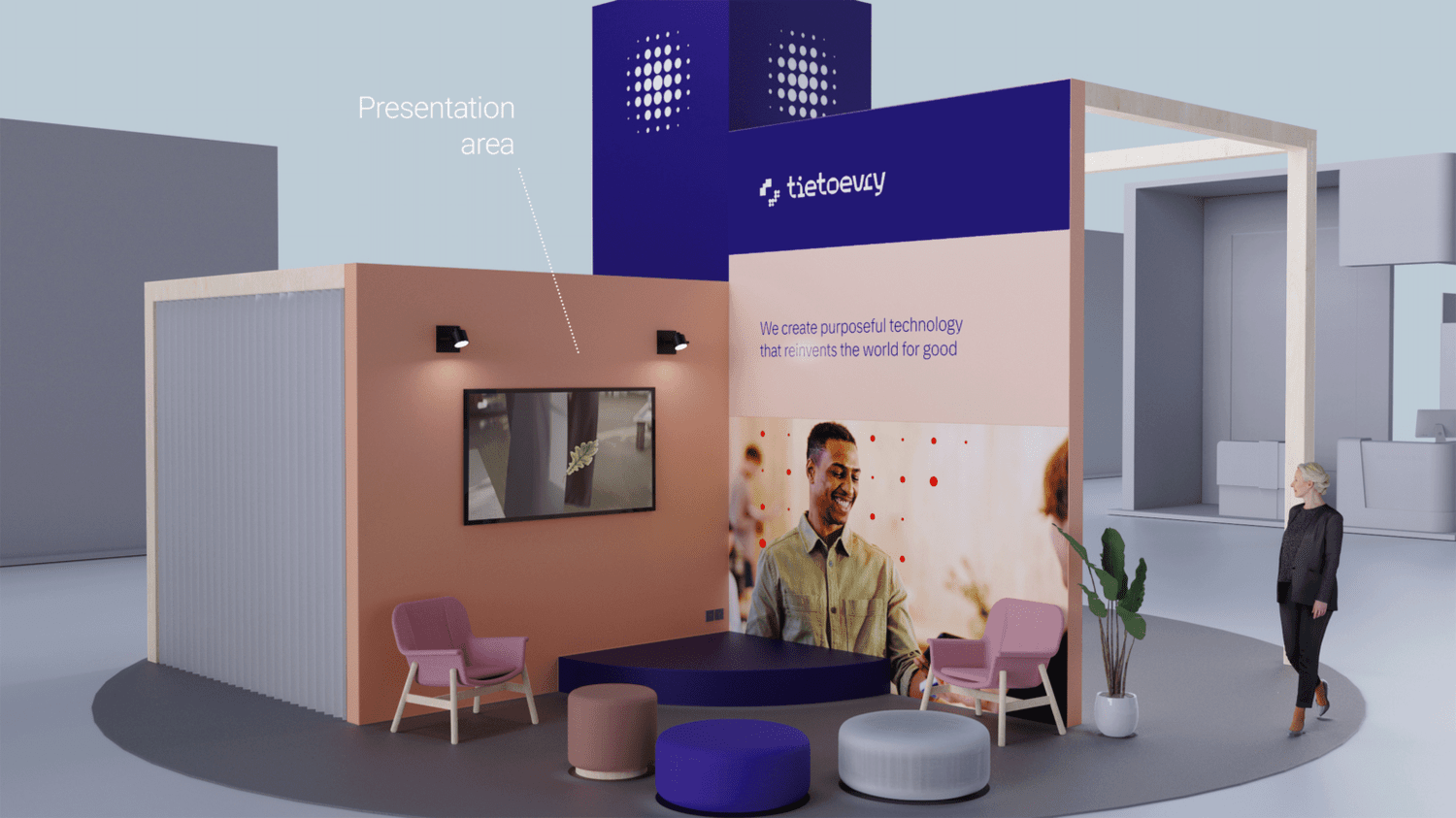
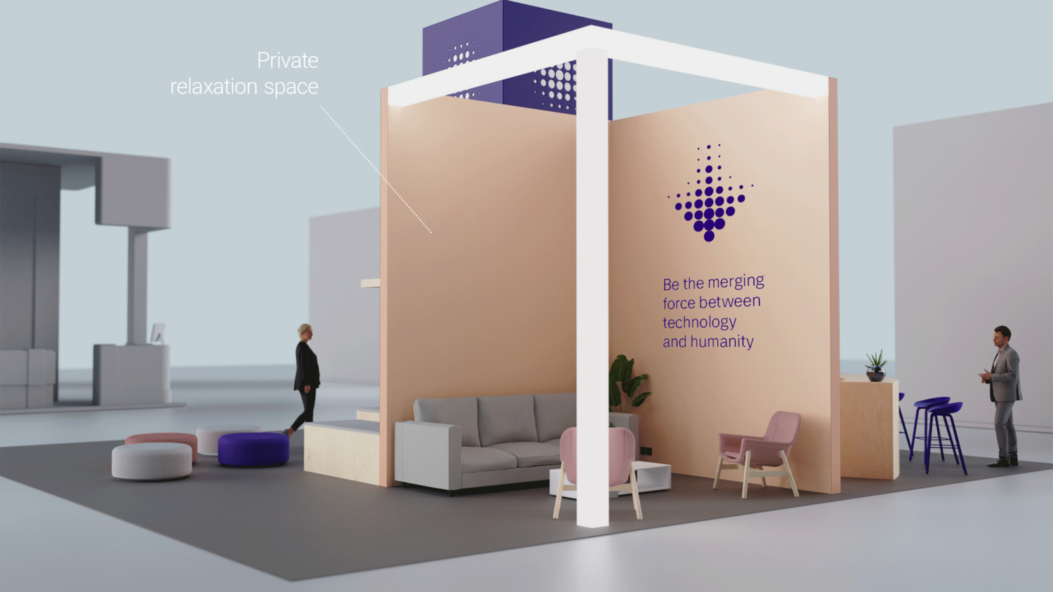
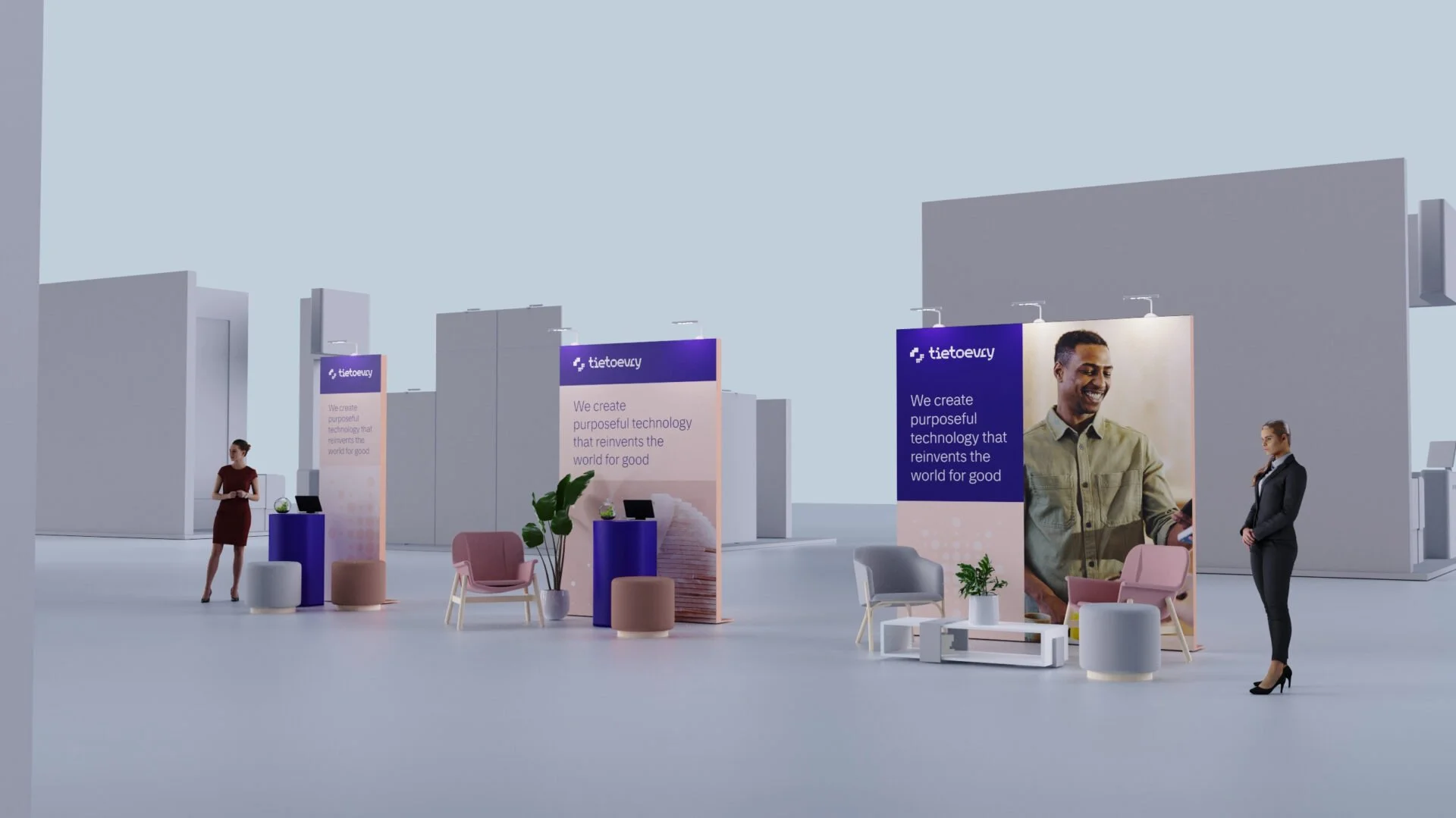
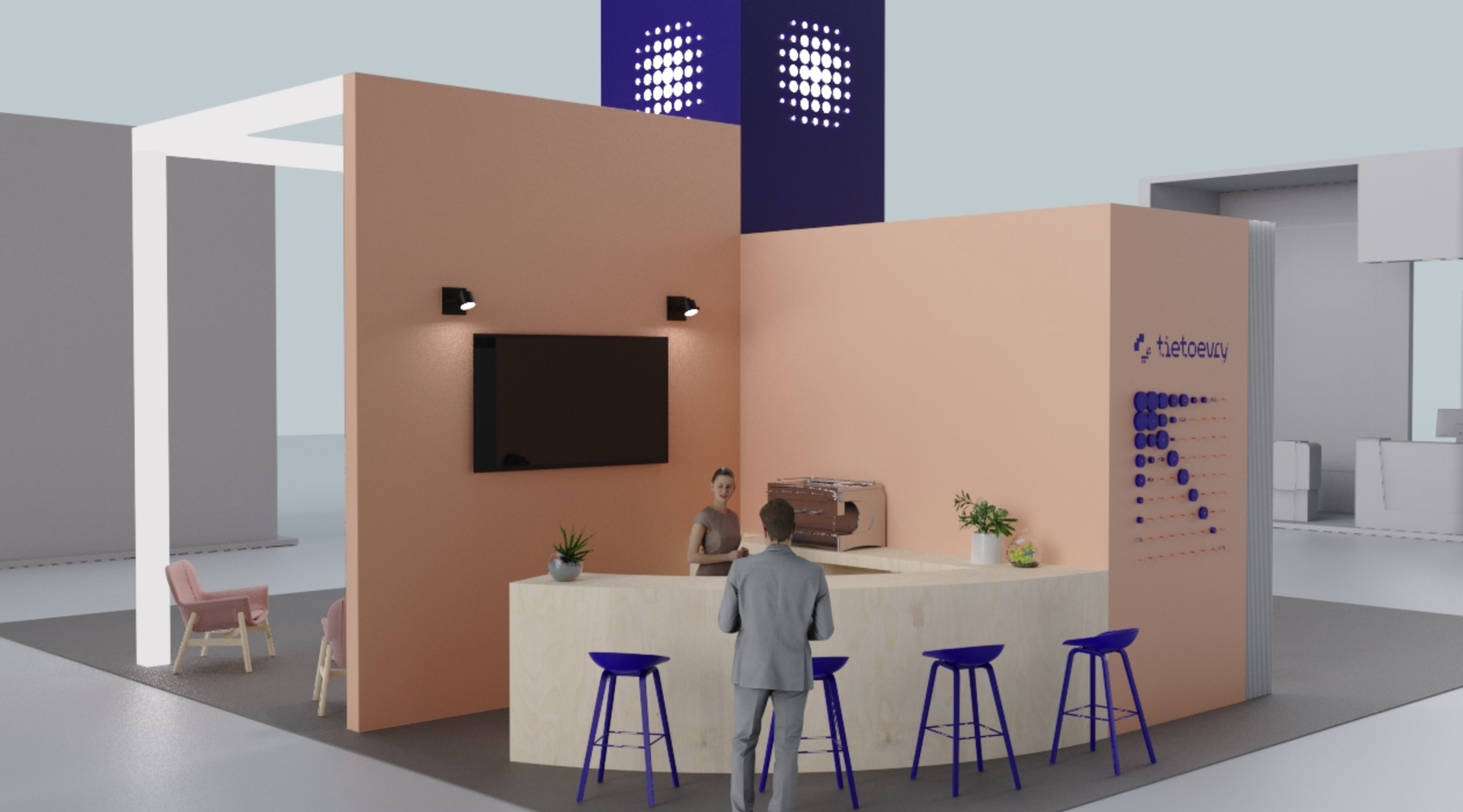
Spatial Planning & Layout
Each layout was designed to balance brand presence with functional needs — ensuring adequate storage, power routing, and display flexibility without compromising the clean visual language.
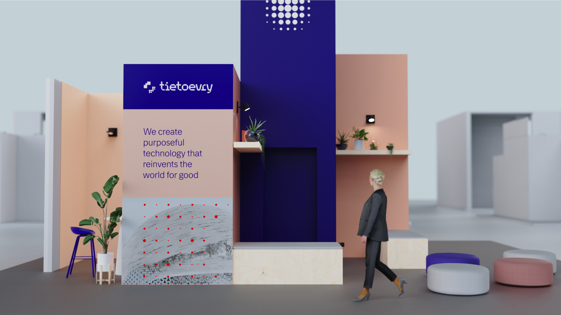
3D Visualization & Refinement
Used Keyshot to create photorealistic renderings that showed how the booth would actually look under different lighting conditions. This allowed stakeholders to review material choices and spatial proportions before committing to fabrication.
The visualization process also revealed practical issues, like signage legibility at distance and the need for adjustable lighting zones, that informed the final design.
Material & Finish Selection
Defined a consistent material palette that aligned with Tietoevry's brand: matte white surfaces, brushed aluminum accents, and strategic use of backlit graphics. Every material choice was documented in a reference guide for future event builds.
Impact & Outcome
The event identity system provided Tietoevry with a clear, repeatable framework for all future physical brand experiences. The modular approach meant the same core elements could be adapted to different event scales without requiring full redesigns.
By establishing clear spatial principles and a refined material palette, the system ensured brand consistency across contexts while remaining practical for event teams to implement and modify.